
![]() Human beings have an inbuilt emotional reaction to colour. This can largely be attributed to biological reasons, as during our evolution the survival of the human race has been dependent upon this in order to recognise through colour how much of a threat is posed by certain animals and plants. Adversely, colour was instrumental in helping our ancient predecessors to successfully identify plants and animals that were safe to consume for sustenance.
Human beings have an inbuilt emotional reaction to colour. This can largely be attributed to biological reasons, as during our evolution the survival of the human race has been dependent upon this in order to recognise through colour how much of a threat is posed by certain animals and plants. Adversely, colour was instrumental in helping our ancient predecessors to successfully identify plants and animals that were safe to consume for sustenance.
Whilst we as a species have come a long way from our prehistoric roots, colour still has a deep and profound impact on thoughts, both on a conscious level and also subconsciously and subliminally. This emotional and impulsive reaction to colour offers businesses and brands a wide range of advantages when it comes to selecting the colours that they utilise in their logo and signage.
This is because there is a diverse range of evidence provided by market research to demonstrate that consumers are influenced strongly by colour to the extent that it helps to form the decisions they make when making commercial choices. In many cases this influence is exerted behind the scenes, and the processing of these colour cues is often similar to an automatic reaction. It is not only the commercial sphere that have been quick to utilise the emotive and rapid responses of humans to colour. Traffic signage makes use of certain colours in order to ease and quicken the communication of a message, such as red for stop, to road users.
![]() Based on this phenomenon of human behaviour it is important for businesses to make effective colour when it comes to their branding, especially when choosing their logo and signage colours. Selecting the right colour for your business’s fascia or signage may well ultimately spell the difference between a customer entering your shop or that of one of your competitors.
Based on this phenomenon of human behaviour it is important for businesses to make effective colour when it comes to their branding, especially when choosing their logo and signage colours. Selecting the right colour for your business’s fascia or signage may well ultimately spell the difference between a customer entering your shop or that of one of your competitors.
Perhaps unsurprising, much time has been spent studying the effect of colour for business and commercial usage, and as a result there are a number of general rules for choosing the optimum colour for your business. However there are also individual differences and exceptions, as with any rule.
Selecting the wrong colour for your business’s signage and logo could have extremely negative implications. Due to the fact that various groups of people have diverse reactions to an individual colour, the selection of a specific colour could inadvertently result in the alienation of a significant section of your audience.
In order to help you to effectively select the optimum colour or colours for use in your business’s signage and logo, we have provided the following guidelines:
Blue
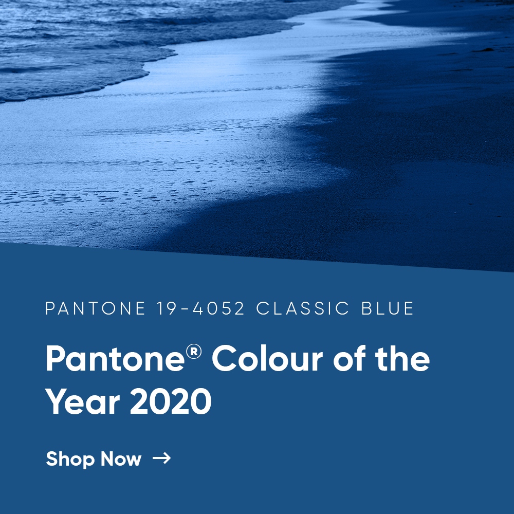
![]() This colour when utilised in business branding, logos and signage is incredibly popular. This is due to the emotional connotations of authority, trustworthiness and success that blue produces. Colour based research has consistently demonstrated that the overwhelming majority of people like at least one shade of this colour, which is both calming and serene in its nature. This colour can be observed used widely and to good effect in the branding of governmental, medical and even some Fortune 500 companies, such as IBM. This usage can be attributed to the qualities of competence, dignity, power, security and high quality. However, companies based in the food industry should avoid this colour at all costs, due to the fact that it is a colour that is rarely edible.
This colour when utilised in business branding, logos and signage is incredibly popular. This is due to the emotional connotations of authority, trustworthiness and success that blue produces. Colour based research has consistently demonstrated that the overwhelming majority of people like at least one shade of this colour, which is both calming and serene in its nature. This colour can be observed used widely and to good effect in the branding of governmental, medical and even some Fortune 500 companies, such as IBM. This usage can be attributed to the qualities of competence, dignity, power, security and high quality. However, companies based in the food industry should avoid this colour at all costs, due to the fact that it is a colour that is rarely edible.
Red
Is used to good effect by a wide range of companies and brands, perhaps the single most popular colour for signage and branding, just look around your local high street! This popularity can be attributed to the colour’s associations with strength, speed, energy and activity. Whilst this colour has many positive attributes, it should be utilised sparingly as over use can be overwhelming, having a negative impact. If you want to grab the attention of your potential customers, look no further than red with its strong emotional pull.
Yellow
![]() The colour generates feelings of positivity and happiness, this in turn has a positive emotional impact on your potential customers, filling them with optimism. In addition to the emotional aspects of the colour, it is bold and stands out making your signage easily recognisable from a distance, great if you want to stand out on the high street. However, you should be careful when selecting yellow for your branding. Research has also demonstrated a less positive impact of utilising yellow. Some people see the use of yellow as cheap and unsophisticated and it has been demonstrated to have connotations of cowardice and jealousy with some people. Therefore, it may be best to use as a trimming or sparingly in your signage.
The colour generates feelings of positivity and happiness, this in turn has a positive emotional impact on your potential customers, filling them with optimism. In addition to the emotional aspects of the colour, it is bold and stands out making your signage easily recognisable from a distance, great if you want to stand out on the high street. However, you should be careful when selecting yellow for your branding. Research has also demonstrated a less positive impact of utilising yellow. Some people see the use of yellow as cheap and unsophisticated and it has been demonstrated to have connotations of cowardice and jealousy with some people. Therefore, it may be best to use as a trimming or sparingly in your signage.
Green
This colour is used widely and to good effect by companies who are environmentally friendly and provide healthy and natural products and services. The usage can be attributed to the colour’s association with both nature and regeneration and its emotive qualities of tranquillity and calm. However, be careful with the specific green you select as it has been shown to create a sense of inexperience and envy with certain groups. Due to the spectrum of green colours available it is perhaps unsurprising that certain shades have been used in specific industries. To demonstrate dark green is used widely by companies based in the financial sector due to its similarity with money. Lime Green, on the other hand, is widely used in start-up companies and new industries, due to its connotations of exploration.![]()
Orange
This is perhaps the optimum choice for brands who are torn between choosing red and yellow, this is because orange successfully blends the characteristics of both of these colours to good effect. Due to the fact that the colour has been demonstrated to stimulate appetites and generate conversion it is perhaps unsurprising that orange has enjoyed wide usage with cafes and restaurants. When using orange, you should be aware of the fact that it is presently the most unpopular colour for use in branding in the western world, so should therefore be used sparingly.